


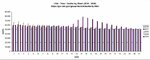
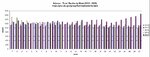
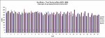
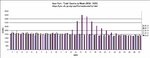
The plots below show the weekly total deaths from any cause for the first 27 weeks of 2016 to 2020 for the USA and select states. It is meant to be a comparison of the number of total deaths during the COVID-19 pandemic vs previous years.
I couldn't find this data in graph form anywhere, so I made these plots from downloadable CDC data(https://gis.cdc.gov/grasp/fluview/mortality.html) and decided to share them.
USA View: https://imgur.com/kM4VqmO

Arizona View: https://imgur.com/bfC6f5X

Texas View: https://imgur.com/jYqwrO9

New York View: https://imgur.com/HVSKg7m

Florida View: https://imgur.com/atcfp2X

New Mexico https://imgur.com/XwN102Y

California https://imgur.com/44niC4h

New Jersey https://imgur.com/dXtOnak

I couldn't find this data in graph form anywhere, so I made these plots from downloadable CDC data(https://gis.cdc.gov/grasp/fluview/mortality.html) and decided to share them.
USA View: https://imgur.com/kM4VqmO
Arizona View: https://imgur.com/bfC6f5X
Texas View: https://imgur.com/jYqwrO9
New York View: https://imgur.com/HVSKg7m
Florida View: https://imgur.com/atcfp2X
New Mexico https://imgur.com/XwN102Y
California https://imgur.com/44niC4h
New Jersey https://imgur.com/dXtOnak
Attachments
-
 USA Total Deaths.JPG197 KB · Views: 0
 -
 Arizona Total Deaths.JPG195.5 KB · Views: 0
 -
 California Total Deaths.JPG200.8 KB · Views: 0
 -
 Florida Total Deaths.JPG222.3 KB · Views: 1
 -
 New Jersey Total Deaths.JPG201.1 KB · Views: 1
 -
 New Mexico Total Deaths.JPG227 KB · Views: 1
 -
 New York Total Deaths.JPG173.3 KB · Views: 5
 -
 Texas Total Deaths.JPG194 KB · Views: 5
Last edited:
